
 X
X Facebook
 Discord
 Instagram
 YouTube
 ChatGPT
RSI Dashboard
The RSI Dashboard is the visual command center of the Ultimate RSI Suite.
It summarizes key RSI conditions across multiple timeframes — including overbought/oversold states, active reversal signals, divergences, and channel breakouts — in a compact table format.
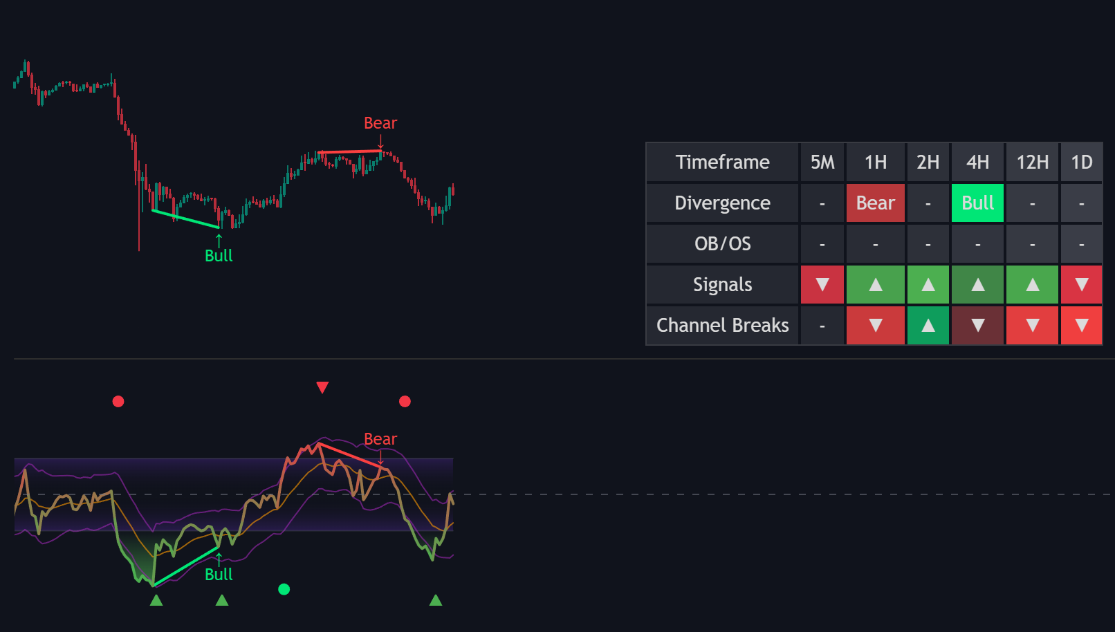
This system lets traders monitor momentum structure across the market without switching charts or timeframes.
Multi-Timeframe Display
The dashboard automatically evaluates RSI data from several predefined timeframes:
Included timeframes:
5M, 15M, 1H, 2H, 4H, 12H, 1D and 7D
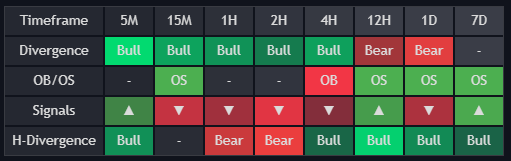
Each row represents a specific timeframe and displays the latest momentum condition detected by the suite.
The table is dynamically updated on the last bar, ensuring a real-time, multi-timeframe overview of RSI states.
Dashboard Columns
The dashboard contains up to five columns depending on which modules are active.
| Column | Description |
|---|---|
| Timeframe | Displays the monitored timeframe (e.g., 5M, 1H, 4H). |
| Divergence | Shows the most recent bullish or bearish divergence. |
| OB/OS | Indicates whether RSI is currently in Overbought (OB) or Oversold (OS) territory. |
| Signals | Displays the latest RSI reversal signals (▲ bullish / ▼ bearish). |
| Channel Breaks | Optional column — visible when RSI Channel is enabled; marks the most recent channel breakout direction. |
| H-Divergence | Shows the most recent bullish or bearish hidden divergence. |
| Cross signals | Shows circle labels after RSI line Crosses signal line but only when momentum moves outside of the central purple neutral zone. |
Each cell includes color-coded highlights for quick recognition:
- Green shades for bullish events (e.g., bullish divergence, oversold zone, or upward signal).
- Red shades for bearish events (e.g., bearish divergence, overbought zone, or downward signal).
- Gray tones indicate neutral or inactive conditions.
Dynamic Color Gradients
The dashboard uses subtle gradient coloring to show how recently each event occurred.
- Bright color = recent signal (within last few bars).
- Faded or transparent color = older signal, still relevant but less immediate.
- Gray background = no current activity.
This allows traders to judge both signal direction and signal freshness at a glance.
Tooltips and Interactivity
Hovering over any cell provides a tooltip with detailed information:
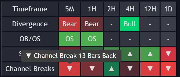
- Type of event (e.g., “Bullish Divergence”, “RSI Signal Up”)
- Number of bars since it last occurred
- Short description of its meaning
This ensures that the dashboard remains clean and minimalistic, while deeper details are available on demand.
Settings
| Setting | Description |
|---|---|
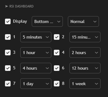
| Display | Turns the dashboard on or off. |
| Position | Moves the dashboard to different corners of your chart (e.g., Bottom Right, Top Left) so it doesn't block your candles. |
| Size | Adjusts the overall scale (e.g., Normal or Compact) to better fit your screen size or resolution. |
| Timeframe Columns (1–6) | Sets which specific timeframes you want to track. Each column is independent, allowing for custom multi-timeframe monitoring. |
The RSI Dashboard gives traders a real-time overview of momentum conditions across key timeframes.
By combining RSI signals, divergences, overbought/oversold readings, and channel breakouts in a single view, it transforms RSI analysis into a clear, actionable framework — helping traders make fast, confident decisions without leaving their chart.
