
 X
X Facebook
 Discord
 Instagram
 YouTube
 ChatGPT
MACD Histogram
What is the MACD Histogram?
The MACD Histogram measures the difference between the MACD line and the signal line. It visualizes momentum shifts with a clear color-coded bar chart that makes it easy to spot transitions in trend strength.
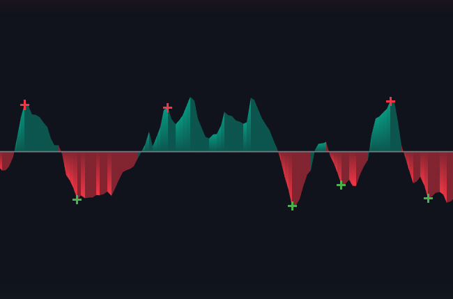
Histogram
This version of the histogram uses dynamic color gradients to show trend strength. Positive (above-zero) bars are typically green or teal, and negative (below-zero) bars are red. The color intensity adjusts based on momentum:
Stronger momentum shows in more saturated colors.

Weaker momentum fades into lighter tones.

Histogram Signals
To help identify turning points more easily, the module can also display signal markers as small plus signs (+). These appear when the histogram changes direction:
- A green (+) marks a bullish reversal in the histogram.
- A red (+) marks a bearish reversal in the histogram.
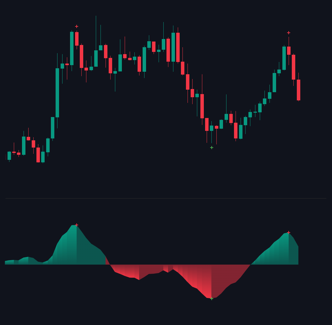
These signals are filtered to appear only at meaningful points, avoiding noise and keeping the chart clean.
They're especially useful when momentum turns at extreme levels or when used in combination with MACD Signals or Divergence detection.
